Flex interview question

Posted July 13, 2009 by priyadarshini
Categories: flex

What is action script?
Actionscript is object oriented programming language which can be used to develop web applications using the flash/ flex IDE and also individually alone too
What is FDS? Or (what is LCDS?)
FDS is flex data services which includes
1. Remote object services ( which includes the web services, remote object services,
http services)
2. flex messaging services Messaging allows many clients and many servers to
exchange messages in real-time. For me, messaging provides a simple distributed
event model that allows to make applications work seamlessly together
How do call a method from java?
Using remote objects we can use flex-config.xml file of the flex server (JRUN4,JRUN5) and include an entry of destination to use the remote objects. Here you include a name to each of the class file and use the same name to use in actionscript)
What is abstract class?
Abstract class is a class which consists of atleast one abstract methos( method with no body)
What is event listener?
Event listener is a function which can be executed on happening of an event
What is event bubbling?
Event bubbling is concept where the container pickes up the event initially then its components.
What is different between command line compiler and eclipse IDE?
Comm. Line compiler is used if the developer is lack of an IDE to develop flex
applications and it requires the user to know each of the command to compile the swf. Eclipse IDE is graphical interface with which the developer can develop web applications and can use IDE for both asctionscripting and designing

What is design tool?
Design tool is one which can help user to layout components of the user interface like an eclise based IDE of flex.
What is security sand box error?
Every swf of flex/flash is surrounded by a container which will be preventing the swf to be access third party applications or domains.
When you get a security stand box error what is the solution?
Use Security.allowdomain(*)
What is difference b/w .swf generated in flash and flex?
There is no difference in the swf , but a compiled swf from flex cannot regain the code like the compiled swf from flash can regain an flv
What is latest flash player in adobe?
Flash player 9 which uses AS 3.0
What is the difference between webservice and remote objects?
Web service/remote object uses SOAP/LDAP protocol and the communication is in terms of XML/Action Media Format data from server to client.
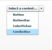
popup menu

Posted June 25, 2009 by priyadarshini
Categories: Controls

<?xml version=”1.0″?>
<!– http://blog.flexexamples.com/2008/01/18/aligning-labels-in-a-flex-popupbutton-controls-pop-up-menu/ –>
<mx:Application xmlns:mx=”http://www.adobe.com/2006/mxml&#8221;
layout=”vertical”
verticalAlign=”top”
backgroundColor=”white” viewSourceURL=”srcview/index.html”>

<mx:Script>
<![CDATA[
import mx.controls.Menu;
import mx.events.MenuEvent;

[Bindable]
private var menu:Menu;

private function initMenu():void {
menu = new Menu();
menu.dataProvider = arr;
}
]]>
</mx:Script>

<mx:Array id=”arr”>
<mx:Object label=”Button” />
<mx:Object label=”ButtonBar” />
<mx:Object label=”ColorPicker” />
<mx:Object label=”ComboBox” />
</mx:Array>

<mx:Style>
.myCustomPopUpStyleName {
textAlign: left;
}
</mx:Style>
<mx:PopUpButton id=”popUpButton”
label=”Select a control…”
popUp=”{menu}”
popUpStyleName=”myCustomPopUpStyleName”
preinitialize=”initMenu();” />

<mx:ApplicationControlBar dock=”true”>
</mx:ApplicationControlBar>

</mx:Application>
popupbutton.

About Popupbutton

Posted June 25, 2009 by priyadarshini
Categories: Controls

The PopUpButton control consists of two horizontal buttons: a main button, and a smaller button called the pop-up button, which only has an icon. The main button is a Button control.

The pop-up button, when clicked, opens a second control called the pop-up control. Clicking anywhere outside the PopUpButton control, or in the pop-up control, closes the pop-up control

The PopUpButton control adds a flexible pop-up control interface to a Button control. One common use for the PopUpButton control is to have the pop-up button open a List control or a Menu control that changes the function and label of the main button, as the following example shows using a Menu control:

Toggle buttonbar

Posted June 24, 2009 by priyadarshini
Categories: Navigator

<?xml version=”1.0″ encoding=”utf-8″?>
<!– http://blog.flexexamples.com/2007/08/22/creating-a-vertical-togglebuttonbar-in-flex/ –>
<mx:Application xmlns:mx=”http://www.adobe.com/2006/mxml&#8221;
layout=”vertical”
verticalAlign=”middle”
backgroundColor=”white”>
<mx:CheckBox id=”checkBox”
label=”toggleOnClick”
selected=”true” />
<mx:Label text=”selectedIndex: {toggleButtonBar.selectedIndex}”
textAlign=”center”
width=”100%” />
<mx:Label text=”direction:” />
<mx:ComboBox id=”comboBox”
change=”toggleButtonBar.direction = comboBox.selectedLabel”>
<mx:dataProvider>
<mx:Array>
<mx:Object label=”horizontal” />
<mx:Object label=”vertical” />
</mx:Array>
</mx:dataProvider>
</mx:ComboBox>

<mx:ApplicationControlBar dock=”true”>
</mx:ApplicationControlBar>

<mx:HBox>
<mx:ToggleButtonBar id=”toggleButtonBar”
dataProvider=”{viewStack}”
toggleOnClick=”{checkBox.selected}” />

<mx:ViewStack id=”viewStack”
width=”160″
height=”120″
visible=”{toggleButtonBar.selectedIndex > -1}”>
<mx:Canvas label=”Red” backgroundColor=”red” />
<mx:Canvas label=”Orange” backgroundColor=”haloOrange” />
<mx:Canvas label=”Yellow” backgroundColor=”yellow” />
<mx:Canvas label=”Green” backgroundColor=”haloGreen” />
<mx:Canvas label=”Blue” backgroundColor=”haloBlue” />
</mx:ViewStack>
</mx:HBox>

</mx:Application>

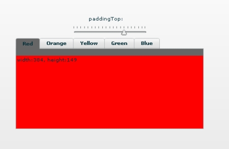
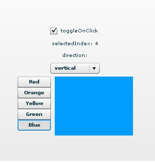
toggle buttonbar

Tab navigator

Posted June 24, 2009 by priyadarshini
Categories: Navigator

<?xml version=”1.0″ encoding=”utf-8″?>
<!– http://blog.flexexamples.com/2007/12/14/changing-the-padding-between-the-tabs-and-content-in-a-flex-tabnavigator-control/ –>
<mx:Application xmlns:mx=”http://www.adobe.com/2006/mxml&#8221;
layout=”vertical”
verticalAlign=”middle”
backgroundColor=”white”>
<mx:FormItem label=”paddingTop:”>
</mx:FormItem>
<mx:HSlider id=”slider”
minimum=”0″
maximum=”20″
value=”10″
liveDragging=”true”
snapInterval=”1″
tickInterval=”1″ />
<mx:TabNavigator width=”386″
height=”186″
paddingTop=”{slider.value}”
backgroundColor=”#666666″>
<mx:VBox id=”vb1″ label=”Red” backgroundColor=”red”>
<mx:Label text=”width:{vb1.width}, height:{vb1.height}” />
</mx:VBox>
<mx:VBox id=”vb2″ label=”Orange” backgroundColor=”haloOrange”>
<mx:Label text=”width:{vb2.width}, height:{vb2.height}” />
</mx:VBox>
<mx:VBox id=”vb3″ label=”Yellow” backgroundColor=”yellow”>
<mx:Label text=”width:{vb3.width}, height:{vb3.height}” />
</mx:VBox>
<mx:VBox id=”vb4″ label=”Green” backgroundColor=”haloGreen”>
<mx:Label text=”width:{vb4.width}, height:{vb4.height}” />
</mx:VBox>
<mx:VBox id=”vb5″ label=”Blue” backgroundColor=”haloBlue”>
<mx:Label text=”width:{vb5.width}, height:{vb5.height}” />
</mx:VBox>
</mx:TabNavigator>

<mx:ApplicationControlBar dock=”true”>
<mx:Form styleName=”plain”>
</mx:Form>
</mx:ApplicationControlBar>

</mx:Application>

tab navigator

Tab bar

Posted June 23, 2009 by priyadarshini
Categories: Navigator

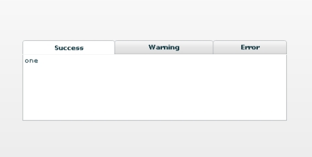
<?xml version=”1.0″ encoding=”utf-8″?>
<!– http://blog.flexexamples.com/2007/08/21/adding-icons-to-a-flex-tabbar-control/ –>
<mx:Application xmlns:mx=”http://www.adobe.com/2006/mxml&#8221;
layout=”vertical”
verticalAlign=”middle”
backgroundColor=”white” viewSourceURL=”srcview/index.html”>

<mx:VBox id=”box” width=”400″ verticalGap=”0″>
<mx:TabBar id=”tabBar”
direction=”horizontal”
dataProvider=”{viewStack}”
width=”100%” />

<mx:ViewStack id=”viewStack”
width=”100%”
height=”100″
backgroundColor=”white”
borderSides=”left bottom right”
borderStyle=”solid”
borderThickness=”1″>

<mx:Canvas id=”child1″
label=”Success” >
<mx:Label text=”one” />
</mx:Canvas>

<mx:Canvas id=”child2″
label=”Warning” >
<mx:Label text=”two” />
</mx:Canvas>

<mx:Canvas id=”child3″
label=”Error” >
<mx:Label text=”three” />
</mx:Canvas>

</mx:ViewStack>
</mx:VBox>

</mx:Application>tabbar

menubar

Posted June 23, 2009 by priyadarshini
Categories: Navigator

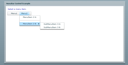
<?xml version=”1.0″?>
<!– Simple example to demonstrate the MenuBar control. –>
<mx:Application xmlns:mx=”http://www.adobe.com/2006/mxml&#8221; creationComplete=”initCollections();” >

<mx:Script>
<![CDATA[

import mx.events.MenuEvent;
import mx.controls.Alert;
import mx.collections.*;

[Bindable]
public var menuBarCollection:XMLListCollection;

private var menubarXML:XMLList =
<>
<menuitem label=”Menu1″ data=”top”>
<menuitem label=”MenuItem 1-A” data=”1A”/>
<menuitem label=”MenuItem 1-B” data=”1B”/>
</menuitem>
<menuitem label=”Menu2″ data=”top”>
<menuitem label=”MenuItem 2-A” type=”check” data=”2A”/>
<menuitem type=”separator”/>
<menuitem label=”MenuItem 2-B” >
<menuitem label=”SubMenuItem 3-A” type=”radio”
groupName=”one” data=”3A”/>
<menuitem label=”SubMenuItem 3-B” type=”radio”
groupName=”one” data=”3B”/>
</menuitem>
</menuitem>
</>;

// Event handler to initialize the MenuBar control.
private function initCollections():void {
menuBarCollection = new XMLListCollection(menubarXML);
}

// Event handler for the MenuBar control’s itemClick event.
private function menuHandler(event:MenuEvent):void {
// Don’t open the Alert for a menu bar item that
// opens a popup submenu.
if (event.item.@data != “top”) {
Alert.show(“Label: ” + event.item.@label + “\n” +
“Data: ” + event.item.@data, “Clicked menu item”);
}
}
]]>
</mx:Script>

<mx:Panel title=”MenuBar Control Example” height=”75%” width=”75%”
paddingTop=”10″ paddingLeft=”10″>

<mx:Label width=”100%” color=”blue”
text=”Select a menu item.”/>

<mx:MenuBar labelField=”@label” itemClick=”menuHandler(event);”
dataProvider=”{menuBarCollection}” />

</mx:Panel>
</mx:Application>
menubar1

About menu bar

Posted June 23, 2009 by priyadarshini
Categories: Navigator

A MenuBar control displays the top level of a menu as a horizontal bar of menu items, where each item on the bar can pop up a submenu. The MenuBar control interprets the data provider in the same way as the Menu control, and supports the same events as the Menu control. Unlike the Menu control, a MenuBar control is static; that is, it does not function as a pop-up menu, but is always visible in your application. Because the MenuBar is static, you can define it directly in MXML.

link bar

Posted June 22, 2009 by priyadarshini
Categories: Navigator

<?xml version=”1.0″?>
<!– controls\bar\LBarBinding.mxml –>
<mx:Application xmlns:mx=”http://www.adobe.com/2006/mxml”&gt;

<mx:Script>
<![CDATA[
import mx.collections.ArrayCollection;

[Bindable]
private var linkData:ArrayCollection = new ArrayCollection([
“Flash”, “Director”, “Dreamweaver”, “ColdFusion”
]);
]]>
</mx:Script>

<mx:LinkBar
horizontalAlign=”right”
borderStyle=”solid”
itemClick=”navigateToURL(new URLRequest(‘http://www.adobe.com/&#8217; +
String(event.label).toLowerCase()), ‘_blank’);”>
<mx:dataProvider>
{linkData}
</mx:dataProvider>
</mx:LinkBar>
</mx:Application>

linkbar

datagrid

Posted June 22, 2009 by priyadarshini
Categories: Datagrid

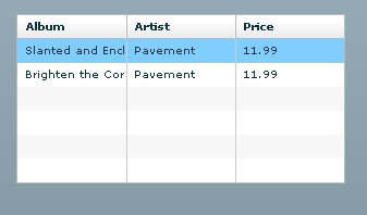
<?xml version=”1.0″?>
<!– dpcontrols/DataGridSimple.mxml –>
<mx:Application xmlns:mx=”http://www.adobe.com/2006/mxml”&gt;
<mx:DataGrid>
<mx:ArrayCollection>
<mx:Object>
<mx:Artist>Pavement</mx:Artist>
<mx:Price>11.99</mx:Price>
<mx:Album>Slanted and Enchanted</mx:Album>
</mx:Object>
<mx:Object>
<mx:Artist>Pavement</mx:Artist>
<mx:Album>Brighten the Corners</mx:Album>
<mx:Price>11.99</mx:Price>
</mx:Object>
</mx:ArrayCollection>
</mx:DataGrid>
</mx:Application>

datagrid